

Rikyū’s tea room offers an experience that begins at the entrance to the garden and continues until the guest leaves. What becomes possible when a design pares things back? Consider first how different his rooms are from the white box often associated with minimalism today.
This article follows the approach from the roji garden to the tea room as a single experience. The low doorway, stepping stones, stone basin, preparation room, and covered waiting bench each have articles of their own.
Rikyū’s tea room is far from a white box
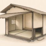
A modern minimalist room may bring to mind white walls, straight furniture, and few possessions. Rikyū’s tea room uses earth, wood, bamboo, and tatami. Its surfaces are uneven and the light varies.
What the two share is a way of narrowing the elements. What those that remain can do matters more than how much was removed.
Earth, bamboo, wood, paper, and mats coexist in the tea room. Each surface absorbs light differently, each joint remains visible, and each material ages. The quiet impression comes from their ability to sit together without competing for attention.
Many materials can make a room feel quiet when their sheen and color do not compete. Earth takes in light, paper lets it through, and wood makes an edge. The distinct role of each keeps the room’s focus clear without making everything one color.
The experience starts before the tea room
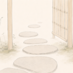
Guests walk through the roji, rinse their hands and mouths at the tsukubai, and enter through the nijiriguchi. A sequence of actions gives them time to make the passage from outside to inside.
A contemporary experience can also be shaped by its approach. Entrance, waiting, directions, and the first thing a visitor sees matter before they arrive at the place they came for.
Walking through the garden, waiting on the bench, cleansing at the basin, and passing through the low entrance all take place before the room can be read as a floor plan. Stride, gaze, and the height of the body change in stages. Guests move into the pace of the gathering without an explanation on the wall.
Show everything at the entrance to a website and a visitor can find themselves sorting through choices. The approach to a tea room offers another model: reveal what is needed as people move, making the next action apparent. The lesson is the order in which information arrives.
The low entrance shows the body what to do
No sign at the nijiriguchi asks people to forget their rank. The height of the opening makes people bend.
A clear shape can lead into an action before another explanation is needed. It gives the body a way to understand what comes next instead of simply telling someone what to do.
The dimensions of the nijiriguchi ask guests to enter low. Smallness alone would do little. What happens on the far side, including the floor, ceiling, and seating, gives the entrance its meaning. A well-formed object or room can show how to use it with less explanation.
Put that entrance in a modern building and some people would be unable to enter. Consider both who will use a place and how its form can support what they do, beyond copying its dimensions. Reducing explanations and restricting access are different choices.
Empty space gives attention somewhere to go
With few things in a room, a character on a scroll, the direction of a flower, and the feel of a bowl become easier to notice. Empty space orders how someone attends to the setting.
On a website, giving everything the same emphasis leaves the reader uncertain where to look. Space and variation in emphasis can help people see what matters.
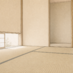
Clear tatami is there for a reason. Because each utensil has a place, the host’s hand can enter an open area, a guest’s gaze can move there, and there is time to take in the next action. The room makes space for movement and time.
Both the hand and the eye need room. So does someone passing by, or someone taking time to understand a piece of information. On a screen or in a room, an empty area can leave the next action possible rather than simply look uncluttered.
Limits give the choices a common direction
Two mats can hold only so many people, utensils, and paths. Every choice affects the others.
Contemporary design also has limits of screen size, budget, and time. They can look like a list of things that cannot be done. When you know who the experience is for and what you want it to offer, the limits can guide choices.
What counts as enough depends on who will use it
The minimum changes with the purpose. Someone who only needs to drink tea may need neither a tea room nor an alcove. In Rikyū’s tea, the host and guests share a time together. Light, flowers, scroll, hearth, and route into the room have meaning for that purpose.
Removing features from a product or website does not automatically make it easier to use. Taking away necessary information can leave people lost. The minimum is what serves the purpose with enough and no more.
Rikyū’s room can be spare in ornament and still act on the body in detailed ways. The entrance changes posture, a window directs the eye, and the hearth shapes seating and a sense of season. One element can support several relationships.
Look at who will use a thing and how before removing anything. Rikyū’s way of doing only what is needed can be read as a method for choosing in light of the guest’s experience.
To learn from a tea room for a shop or website, follow its sequence. Can someone find the way from arrival to where they need to be? What do they see first? Does too much information hold them up? Those questions carry further than copying a wall finish or a low entrance.
Conclusion: Removing something can make a relationship visible
Think through where someone enters, what they see, and how near they will be to others, as parts of one experience. That way of looking can carry Rikyū’s tea room into the present without reproducing it.
A room can let the relationships between people and things, and among people themselves, come into view. In that sense, the small tea room still raises a question for anyone designing a place.
Removing something gives what remains a chance to be seen.
Doing only what is needed is the result of a choice about how people will use a place. It takes the ability to observe before it takes the ability to pare back.
Consider the bodies of the people who will use a place, the order in which they will move, and where their attention will go. Then let materials and dimensions follow those relationships. That process can come from a tea room even where the building looks entirely different.
 Why Did Rikyū Choose Small Tea Rooms? Two Mats and Four and a Half
 The Roji: How a Garden Changes Your Pace before Tea
 Why Can a Small Tea Room Feel Spacious?
 Who Was Sen no Rikyū? The Life of the Man Who Changed Chanoyu