

Empty space sets the distances between things. It also directs attention, makes room for movement, and gives people time to look. What do a tea room and a piece of graphic design share in the way they make space work?
Empty space is a choice about what goes where
Leaving more blank space is no guarantee of beauty. What goes around an empty area, and who looks at it from where, determine whether it works. The person who makes it chooses what to leave out. The person who encounters it has room to decide how to read it.
Space left over after a layout is finished differs from space left purposefully clear. Negative space separates elements, orders the movement of the eye, and gives the viewer a place to pause.
In a tea room, simply having few utensils is of little value on its own. The relation between alcove, hearth, tatami, and door lets the clear areas guide the guests’ actions and attention.
The body and time enter the empty space of a tea room
Space on a page works mainly on the eye. In a tea room, people sit and walk, and the utensils are carried through. A room can also hold the interval in which a sound fades or people wait for another gesture.
A clear area gives people somewhere to sit, turn, and handle utensils. It shapes distance, speed, and tension as well as what they see.
Both do more than make a focal point stand out
Empty space makes it easier to read the relationships among elements, leaving room for the audience to take part. It shapes how information is received as well as how much there is.
A tea room and a page differ in ways worth keeping in view. Still, both call for the same care in choosing where to place something and where to leave an opening.
Leaving space means trusting the person who receives it
More explanation, decoration, or utensils may look like a clearer statement of intent. It can leave the recipient less room to fill in, reflect, and feel.
Leaving an opening gives the recipient a kind of voice. The choice is how much needs to be said for the idea to reach someone.
Culture changes how empty space is read
An abundance of white does not make a work Japanese. Ways of using empty space have developed across calligraphy, picture scrolls, architecture, gardens, and the performing arts. Each practice relates to the body and time differently.
The open areas of a tea room give people places to pass through and carry utensils, meet another person’s gaze, and let sounds fade. A room with fewer things does not automatically make for a richer experience.
Borrowing the surface without its background turns negative space into a sign for “Japanese style.” Consider what a setting asks people to respect or wait for, and who has a say in what it means. Leaving space can be a way of taking that relationship seriously.
Decide how things relate before removing information
The hardest part of removing an element in design is deciding what the remaining elements will do and what the space around them will convey. When their relationship is still unclear, reducing what people can see can leave them without the help they need.
In the tea room, the alcove, the hearth, the lines of the tatami, and the entrance set one another’s positions. In graphic design, lettering, photographs, line spacing, and the page edge do similar work. Edges and distances create meaning in both media.
Good negative space gives the viewer enough guidance to follow a sequence while leaving the interpretation open. It lets a designer’s care and a viewer’s freedom coexist.
Making more space does not guarantee refinement
Expanding the space around elements is often used to suggest luxury. Without a clear relationship among them, a wide area can look like an interval stretched too far or like a piece of information is missing.
Taking utensils away does not automatically make a tea room quiet. Empty space works when the positions of the alcove, hearth, guests, and host support one another, and the clear area has a role.
A sense of refinement comes from a distance that makes sense in the setting. The body should be able to feel why an area was left clear.
Edges give empty space its character
Empty space has a shape. A page edge, a post, the border of a tatami mat, or the sill at the front of the alcove defines it.
Two areas of the same size can feel different. An enclosed one can create tension, and an opening outward can extend the space. Look at what surrounds it and where it leads.
In a design, look at the edges as well as the elements. In a tea room, look at the gap between an object and the wall. A relationship may be clearer at the edge than in the center.
Leaving space gives the viewer some say
An explanation can guide the interpretation. Leave part of it unwritten and the recipient’s experience can enter. Giving people room to interpret is one way to take responsibility for communicating.
Delegate too much and the idea may not come through. Decide too much and the recipient has no room to take part. The balance matters in a tea room as it does in editing.
The beauty of an empty area can lie in the trust between the person who made it and the person who receives it.
Compare the two kinds of space through what the body does
Increase the space on a page or screen and someone will often say something is missing. The hard part is arranging the elements so the clear area has a purpose. Empty space in a tea room always makes me think of that difference. A wall looks bare, but the light, the alcove, the utensils, and the movement of people are all given room to reach it.
A small tea room can feel larger in person than it did in a photograph. I think that happens because the eye cannot take it all in at once. Enter through the nijiriguchi, change posture, look at the alcove, and turn to the utensils. The space opens in sequence and gains a spaciousness the body experiences in time.
I am wary of borrowing “Japanese negative space” as a look. A beige background and thin rules do not create it by themselves. What will hold the center, what will appear first, and where will the viewer have space to think? Those choices give a clear area a job. It is in their attention to relationships that the room and the page have most in common.
Look at what an unoccupied place allows
In practice, decide how the focal and supporting elements relate before increasing the empty area. If what people see first and what they notice later are unclear, more space will only weaken the composition. What I would borrow from a tea room is the attention to the order in which the eye and body encounter things.
Conclusion
The space of a tea room contains time and bodies. The space of a graphic composition works chiefly with sight and information. Both organize relationships among elements and leave room for someone to take part. A clear area can set the distance between objects, leave people room to move, and give the eye a chance to stop. The practical question is how to give what remains the conditions it needs to work.
The two are linked by what areas without objects or information make possible: a shifting gaze, a movement, or the time to wait for what comes next. Before making an empty area smaller, ask what it makes room for.
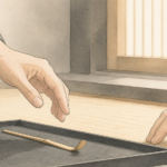 Ma in Chanoyu: The Intervals in Movement, Space, and Conversation
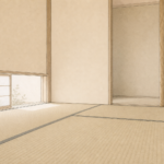 Why Can a Small Tea Room Feel Spacious?
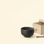 Honrai Muichimotsu: What It Means to Be Free of Attachment